
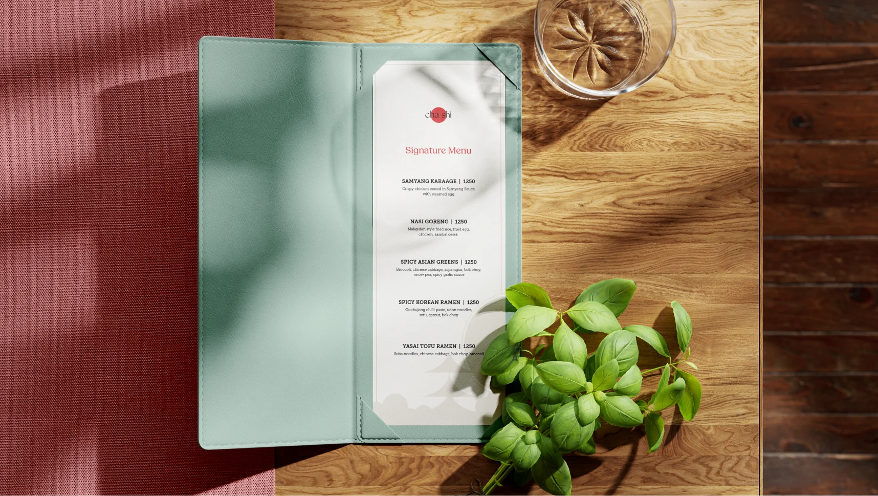
DLF Cha Shi
DLF Cha Shi is a cozy retreat where comfort meets culinary artistry. With a menu crafted around fresh, wholesome ingredients, it serves everything from hearty meal bowls and dim sums to innovative sushi rolls. Every detail, from the chic wooden interiors to the thoughtfully curated beverage selection, is designed to create a warm and inviting experience. The goal is to translate Cha Shi’s essence into a brand identity that reflects its unique blend of tradition and modernity.
services
Brand Identity Design
Brand Collaterals
team
Shubham Harish
Riya Rathod
Munazah
Vasukrupa
The Problem
Cha Shi, positioned as a space between a casual café and a fine dining restaurant, lacked a cohesive brand identity. Despite having a logo and a defined physical vibe, the absence of a brand language, tone, and visual system made it challenging to stand out in the competitive market of Asian dining.
goal
To give Cha Shi an identity that truly reflects what it stands for - a space that’s balanced, approachable, and refined. The goal was to move beyond just a logo, creating a brand that connects with corporate professionals while still being inviting for anyone looking for a simple, sophisticated dining experience.
The solution
GreySpace began by understanding the core of Cha Shi - its positioning between a casual café and a fine dining restaurant. We built on the existing space’s vibe and worked to create a brand identity that was minimalist, sophisticated, and distinct from the typical Asian restaurant aesthetics. We designed a complete identity system, including packaging and business materials, with a simple yet refined approach that allows Cha Shi to stand out in the competitive dining market. The result is a brand that feels modern and inviting, striking the perfect balance between casual and fine dining.


